


Dehesa MX
Dehesa MX seeks to be a leading company in the gourmet products sector, specialized in wholesale with a strategic focus on the North American market (United States, Canada and Mexico) and Asia (China, Japan and Singapore). The company is distinguished by its unwavering commitment to quality, offering an exclusive selection of products that stand out for their exquisiteness and carefully selected origin. From artisanal foods to international delicatessens, focused and with a strong presence in the sale of high-end wine.
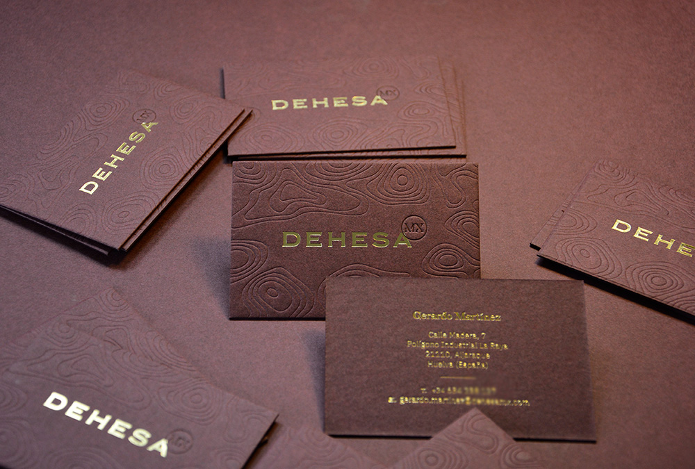
We have carried out a complete corporate image design that reflects the professionalism and seriousness behind the company. With a classic and timeless design but also playing with modernity when representing the Mexican origin of the brand in the design of the typography for the MX element that acts as a seal of origin. For the color palette, we relied on metallic gold along with a selection of maroon colors evoking the wine sector.
In addition to this proposal, it was necessary to design a complementary image for the Dehesa brand that would be represented in future gourmet stores, and in a direct sale to the buyer. Maintaining the initial typography, we changed the color palette for an elegant palette of saturated greens, and created packaging solutions that could be sold in establishments.