


Rock & Love
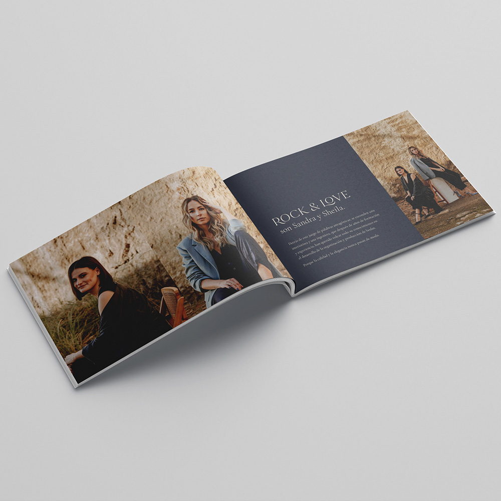
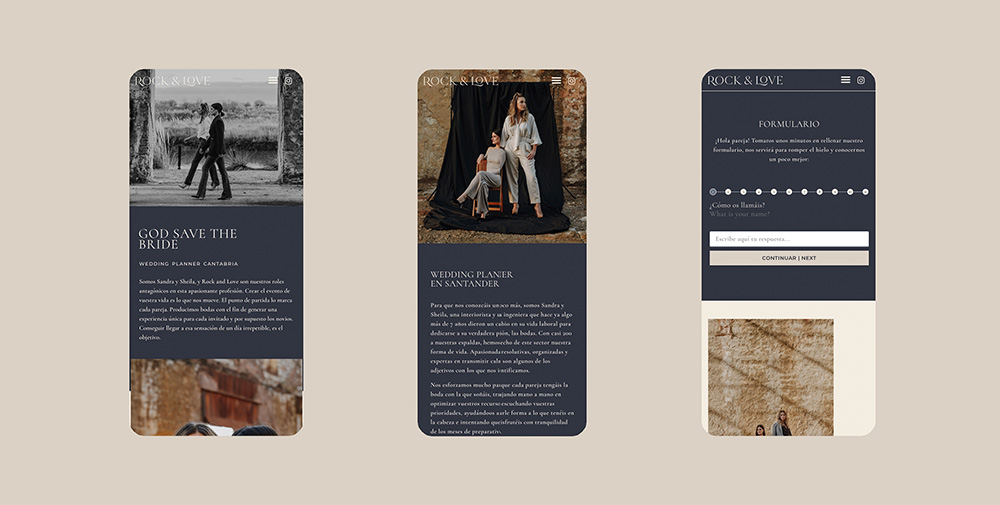
Sandra and Sheila are Rock&Love, specialists in wedding planning and event services who have years of experience in the sector. They came to us as they wanted to update their image to show a much more professional appearance that better reflected their work.
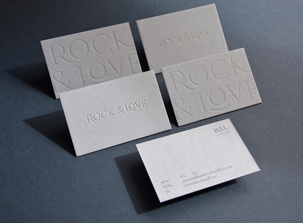
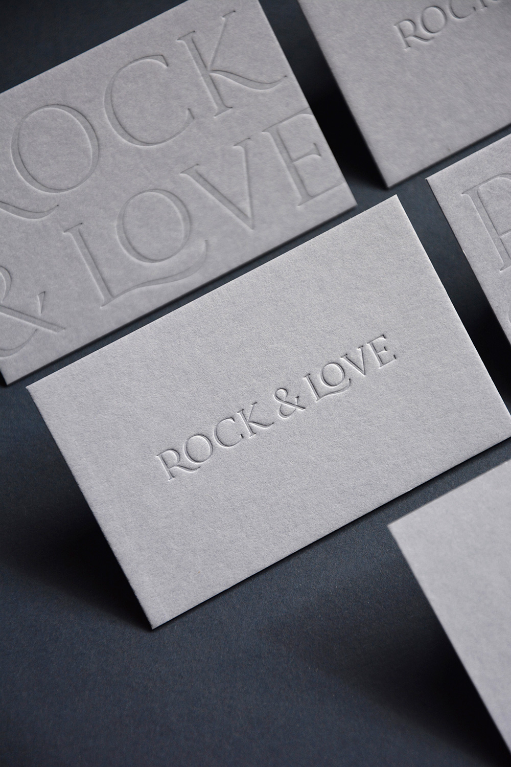
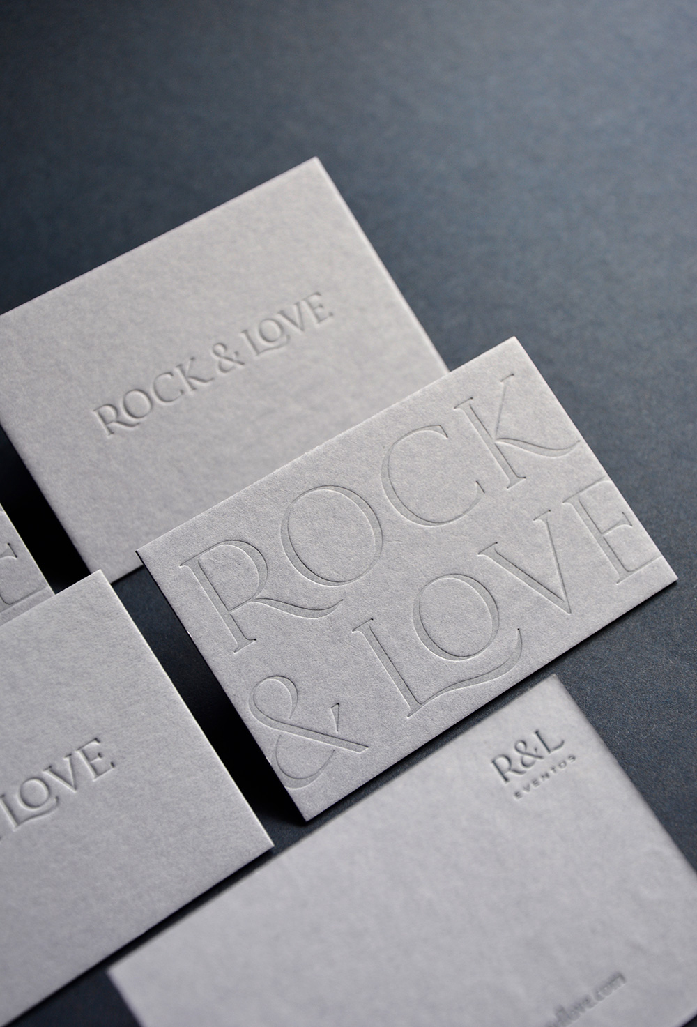
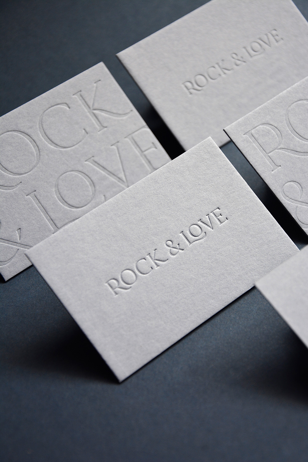
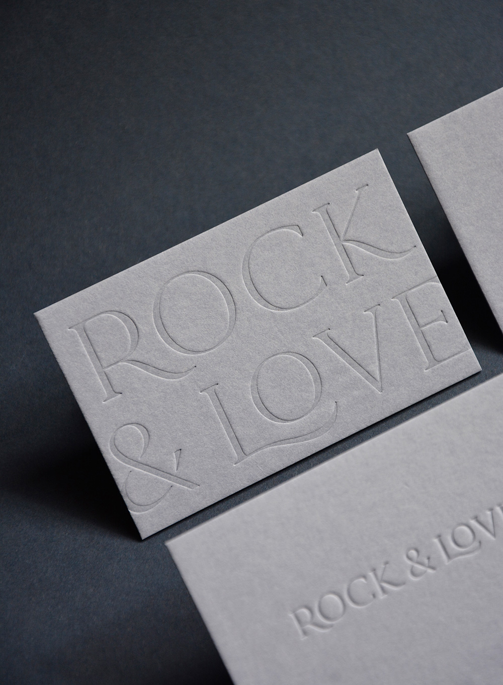
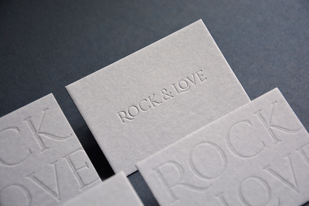
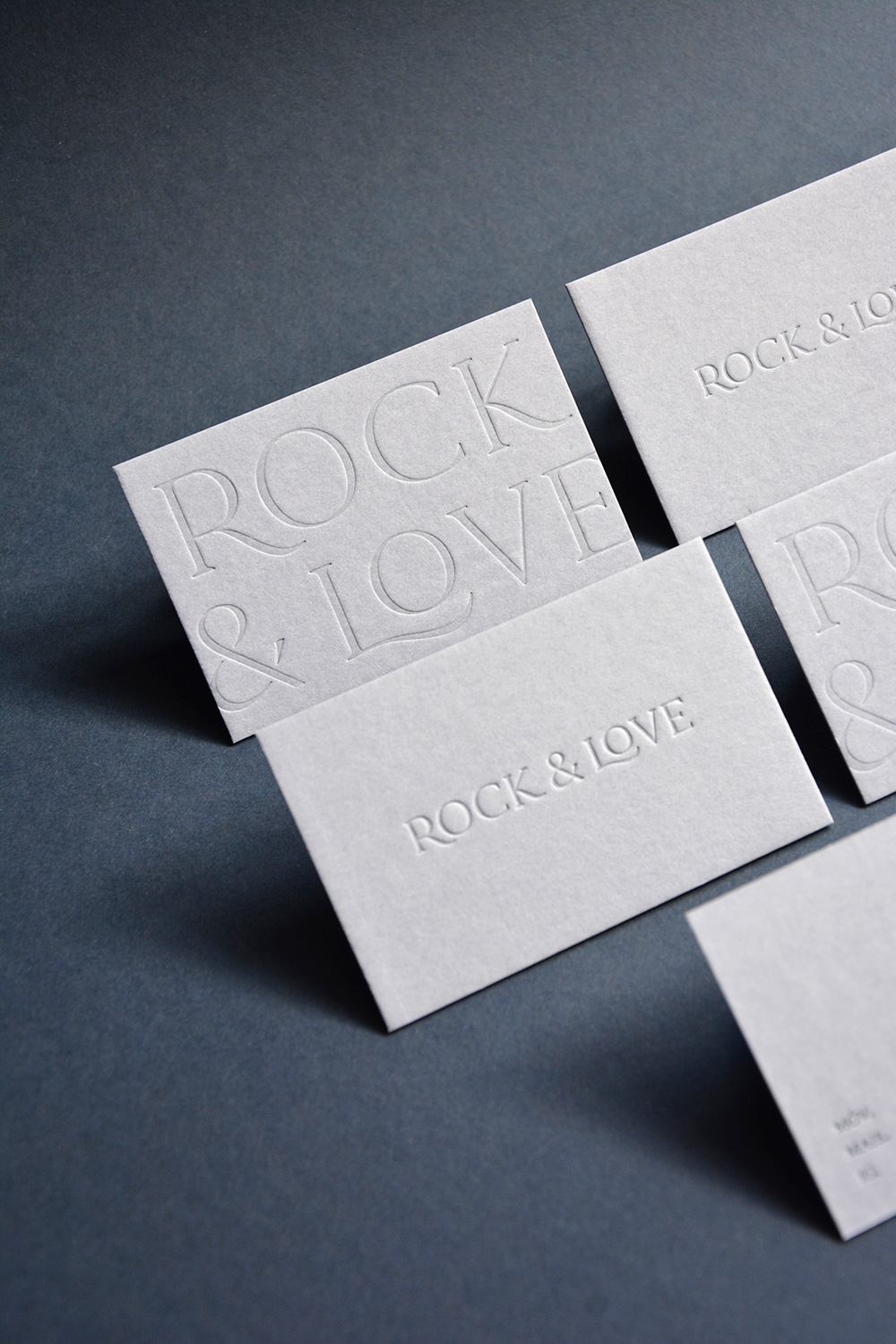
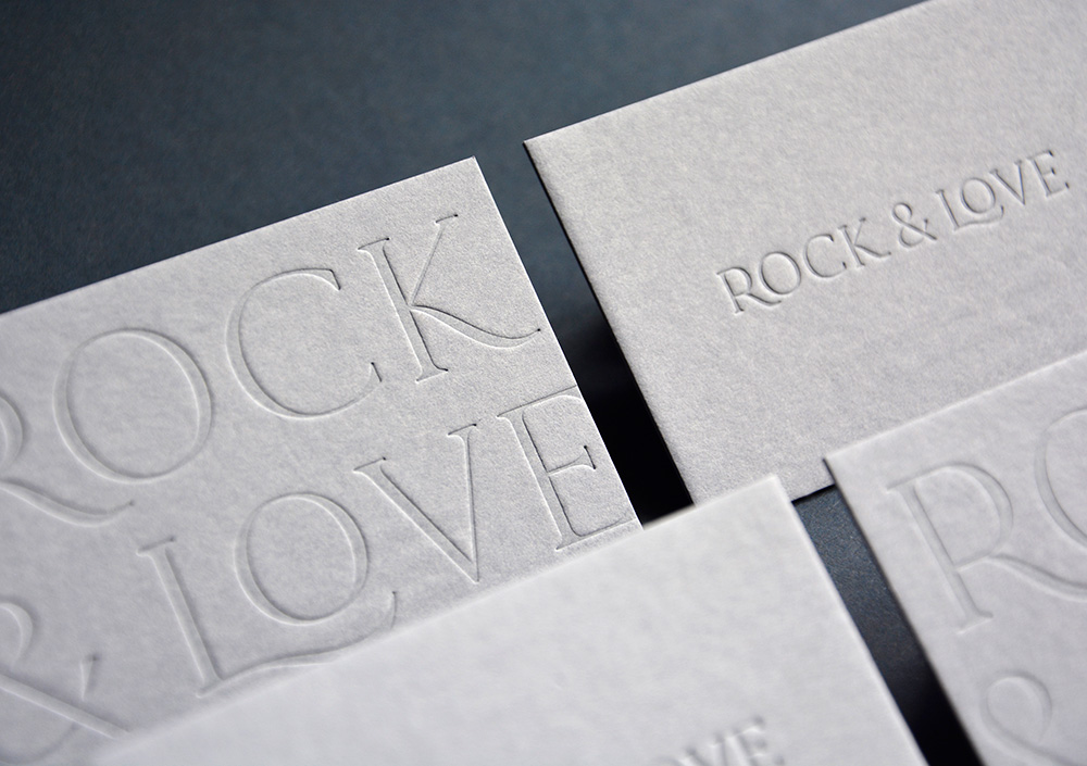
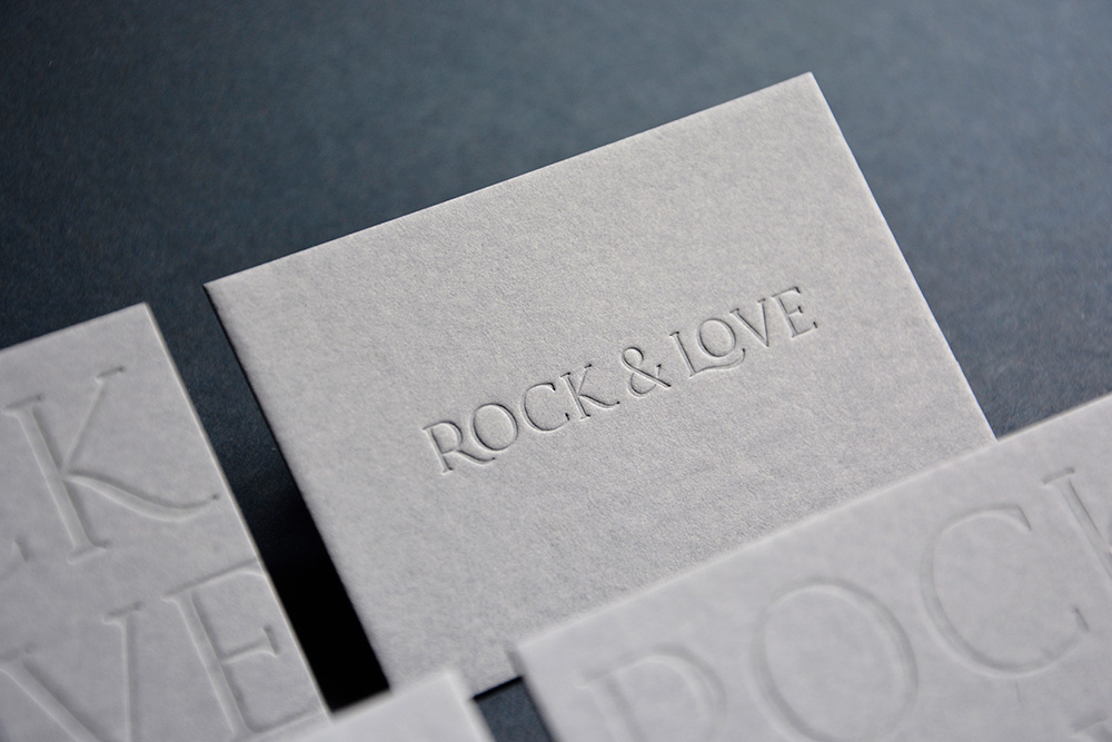
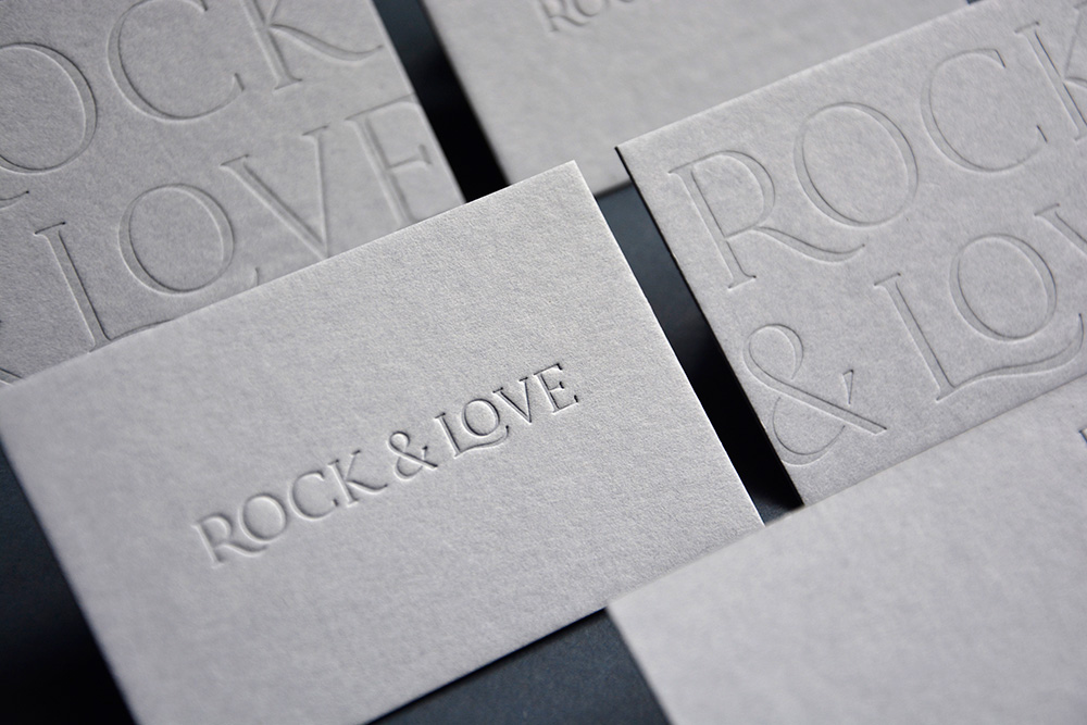
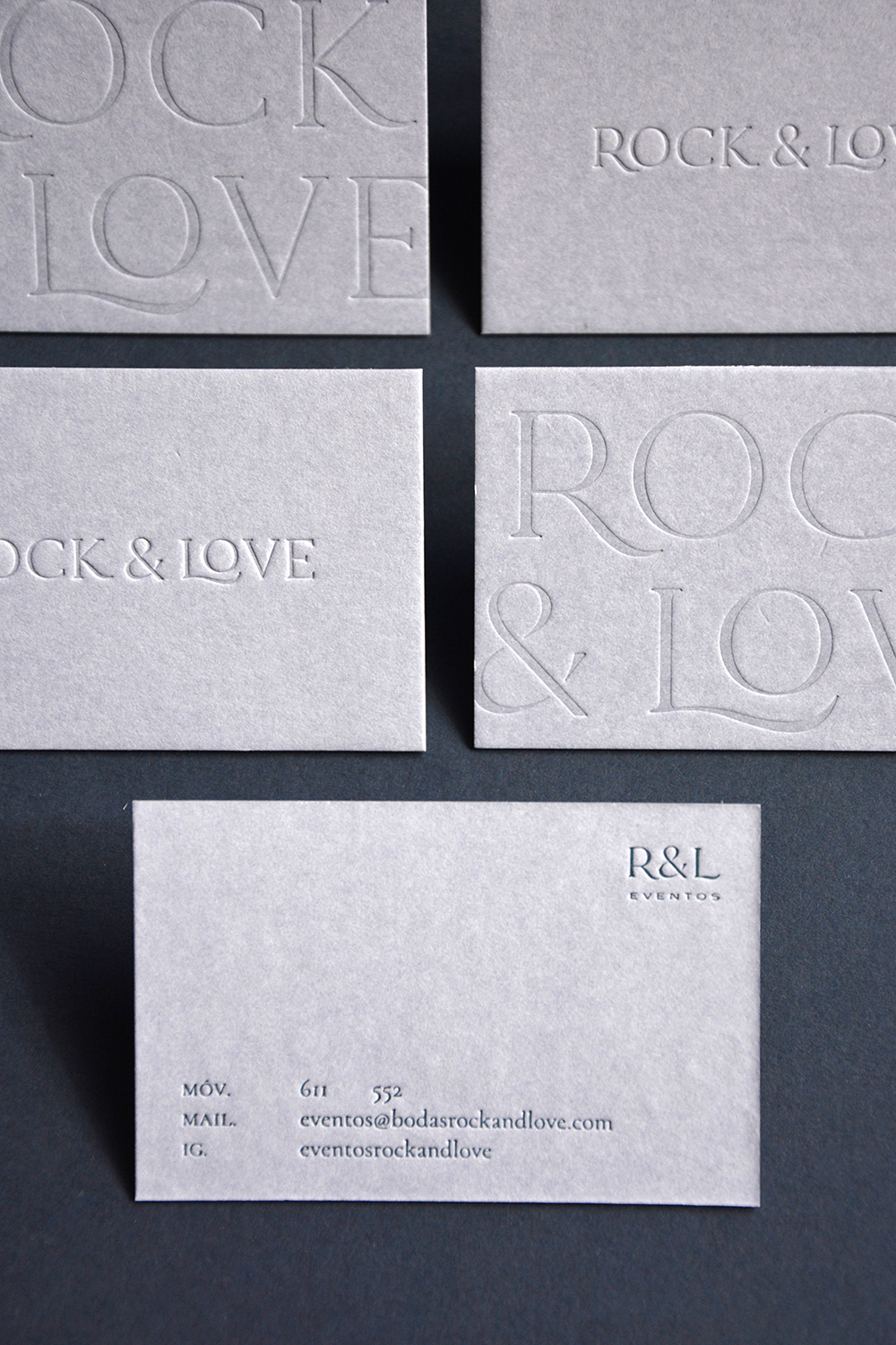
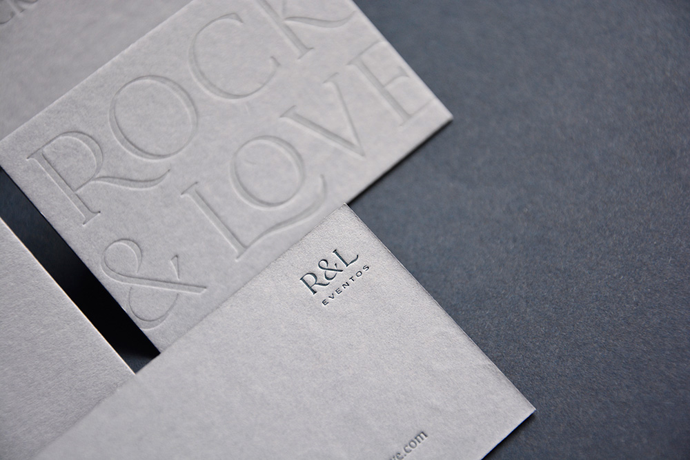
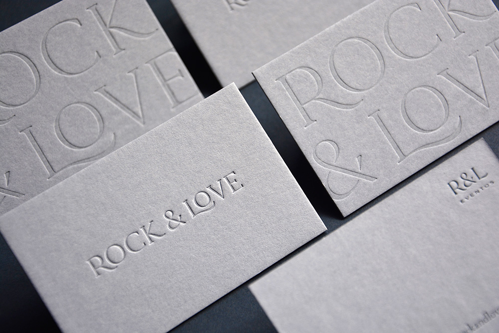
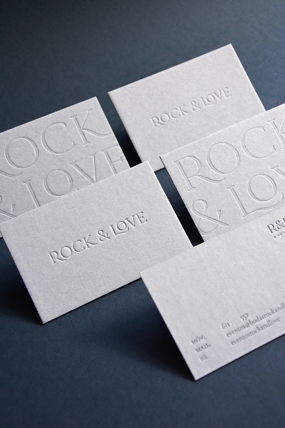
The main piece on which we started for the new image is its logo. Two versions to represent vertically or horizontally depending on the applications where to display it. Designing each letter to measure to obtain a logo with a classic appearance but with small nuances that can differentiate it, and with a combination of two totally different typographic styles for the ampersand symbol (&) and the rest of the text. Looking for a timeless image that provides class, security and trust, transmitting the professionalism behind the company.
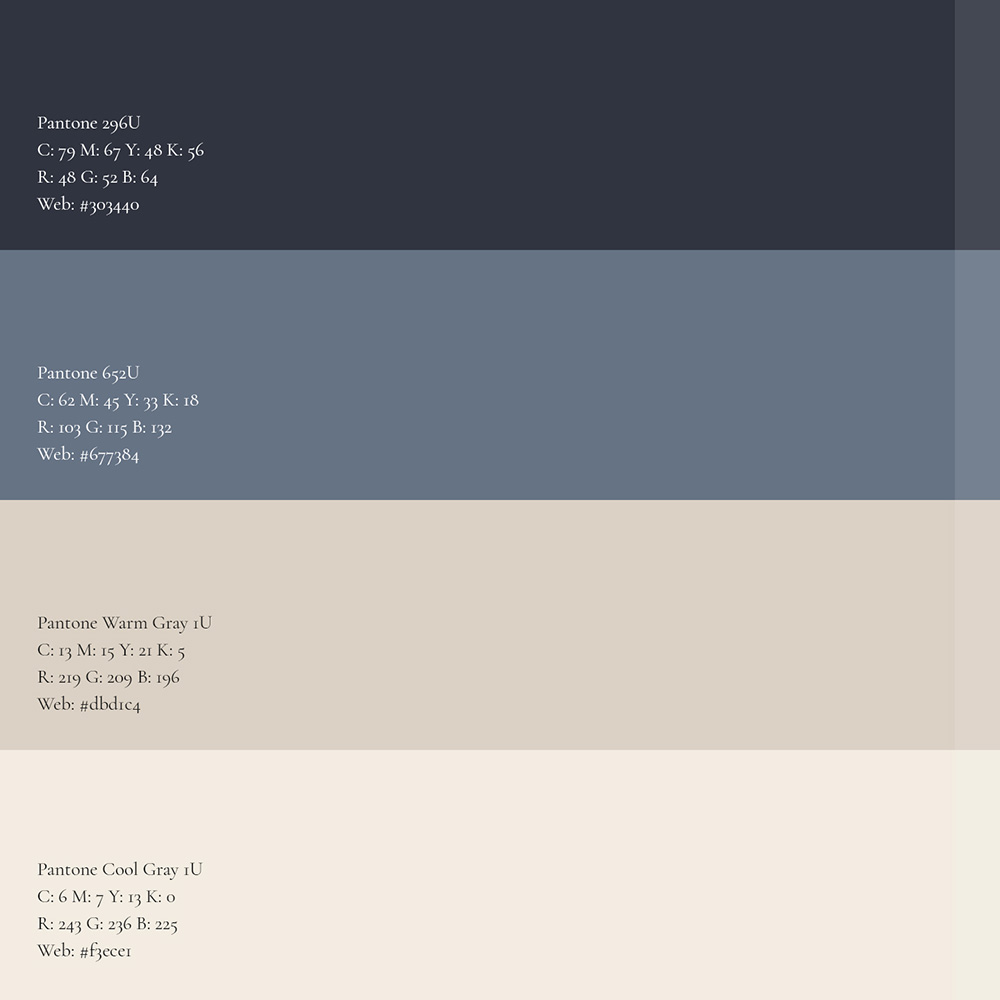
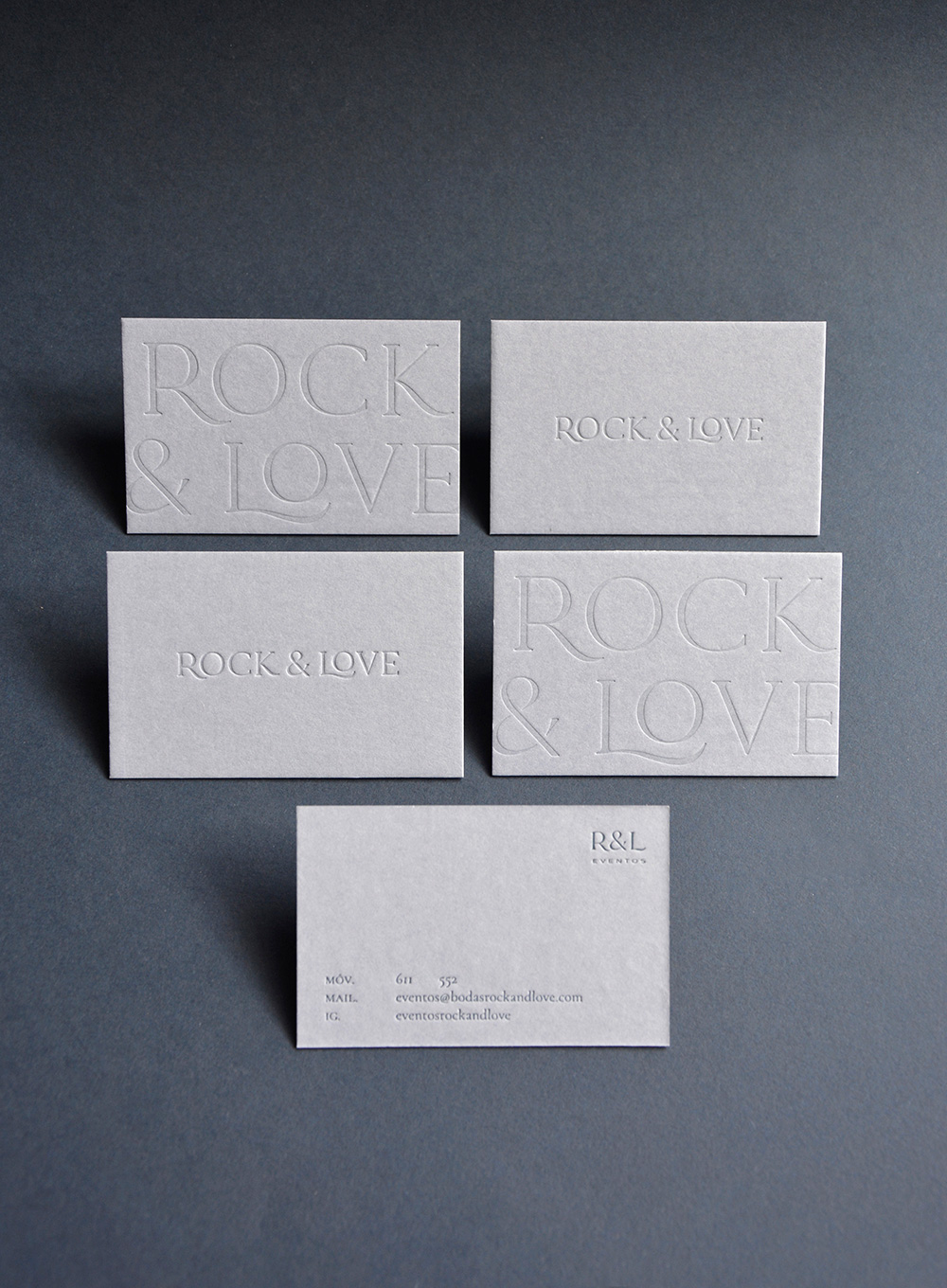
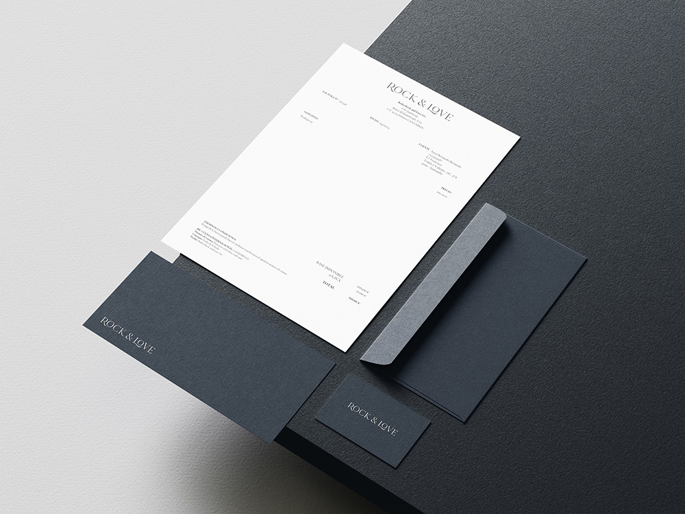
The work we did also included a review of their stationery, and the creation of business cards that were in line with their new style. We chose a natural paper with a color within their palette, and letterpress printed two models of cards: one for their wedding business line (@bodasrockandlove), and another for events (@eventosrockandlove). In addition, we define a corporate color palette and font families that accompany the brand in any of its applications, such as, for example, when renewing its website.