


Bendinat
This time we are facing a redesign and update of a previous logo. Bendinat company already had a previous image, but its design and aesthetics did not correctly reflect the qualities that they wanted to show their customers.
We started from the base of its previous image but we carried out a total face lift, creating a new logo that would reflect the professionalism of the company. Bendinat deals with the management and maintenance of holiday communities, so their clients must have complete security of resorting to a competent company when depositing their homes in them.
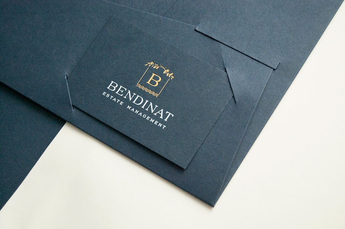
We respect the previous design of the logo to combine plant elements of the area with elements that evoke the sea, the coast and the beach. And we propose the two positive and negative versions that would be used in the design of the stationery and future applications of the brand.
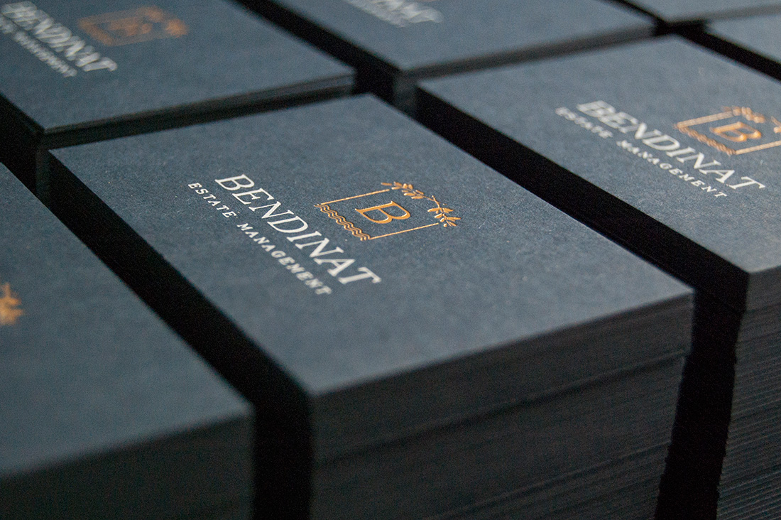
In the color palette we opted for a navy blue main tone, together with an ocher gold, which could also be turned into metallic gold when applied by stamping on the stationery.
Finally, we design and produce all the elements that the client would need: from electronic signatures for emails, brand image on social networks, to stationery items such as envelopes, folders, cards and folios.
For the printing of the works we use a navy blue paper with the same tone of the corporate color of the brand, in addition to natural white papers, and screen printing, metallic gold stamping and offset for the most common elements of use such as envelopes or corporate folios .
A complete redesign and facelift for a brand that surely now produces a correct image of what it wants to reflect to its customers.